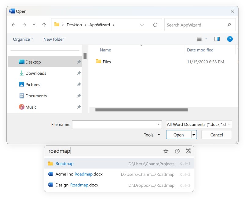
On the Listary home page, below a brief summary of what Quick Switch does, is the following image
But Listary looks very different after it has been installed, as shown in the image. There is only one pixel of space between the search field and the dialog box, and it also does not have rounded corners, a feature in many apps that work on Windows 11. Also, as can be seen in the previous image, the search results are always displayed below the dialog box. In the current version, when I type something, the search results appear above the dialog box
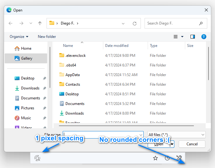
In my opinion, Listary looks great in the first image with its rounded corners and some space between the Open/Save dialog, I would also like Listary to have rounded corners when searching inside the file explorer.
I hope that in a future version it can look like the first image. ![]()